Charting the Match Charting Project
19 Sep 2015With the existence of Hawkeye and the IBM Slamtracker, tennis fans might be under the impression that the CPUs of tennis analysts are overflowing with high-quality stroke-by-stroke data on today’s matches. Regrettably, this is far from the truth. The data that drives the most interesting visualizations during a broadcasts, like summaries of the frequency of shots by their position on court, or the data behind the Challenge System are under the proprietary control of a few corporate giants (IBM for the Slams, SAP for the WTA), which means they are also out-of-reach of tennis researchers.
While the siloing of data is a problem in all sports, some sports have made significant efforts to make rich data sets available to the public. The MLB’s PITCHF/x and NBA’s SportVU data are prime examples. At the same time, these sports have sprinted ahead in the analytics race. And this isn’t a coincidence. Putting good data in the hands of passionate hobbyists has been a reliable formula for breakthroughs in the history of sports analytics.
Tennis analysts are still waiting for their SportVU.
Sadly, tennis associations and federations don’t seem to be aware that the sport is being held back by its current model of data sharing. This has left it to individuals outside of the official tour system to tackle the problem with more limited resources. The one person who has done the most to answer this need is Jeff Sackmann, the creator and maintainer of TennisAbstract and the Heavy Topspin blog who is leading multiple efforts to put more and better tennis data into the public domain.
One of these efforts is the Match Charting Project. Frustrated by the lack of shot-by-shot data on tennis, more than two years ago now, Sackmann established a structured spreadsheet that non-professional scorers could use to chart each point in a tennis match and upload the information to the TennisAbstract.
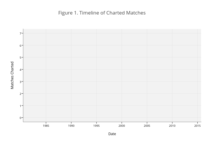
Figure 1 shows the progress of the project so far. Dozens of contributors have gotten involved and 1,100 matches have been charted as of this writing. To help persons who might be interested in using these data for research, I wanted to take a closer look at some of the meta-data of what is available. To find out more about the information collected on each match you can read here. For R users, I have compiled and processed the data to make it more ready for analysis, which you kind find in the development version of the deuce package.
The charted matches include both the the men’s and women’s tours, currently, in fairly equal number (526 for the ATP and 574 for the WTA). Figure 2 shows the breakdown of contributions by contributor. We see that a handful of contributors have been responsible for the majority of the contributions. In fact, 80% of the 1100 matches have been charted by just 5 contributors, and 479 of those by Sackmann. Outside of this group, most contributors are charting few matches (34 contributors have done 2 or fewer matches), which could be an indication that the project is still picking up steam or that the actual charting has a high-cost to entry.
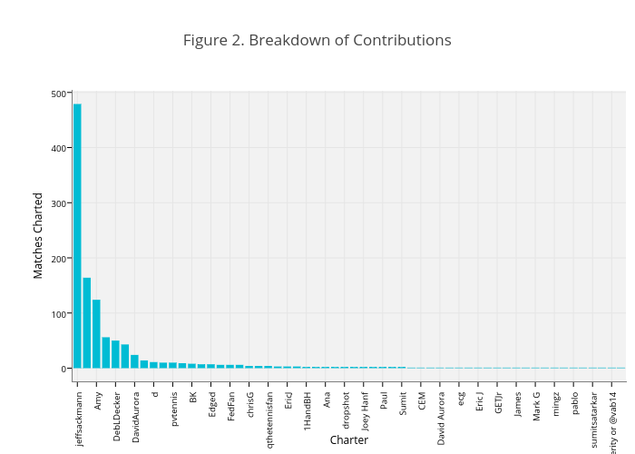
The fact that the bulk of the contributions to the project have been owing to the efforts of a few persons has pros and cons. On the one hand, it should give us greater assurance that the quality of the scoring for these contributors is high because they have had a lot of experience. On the other hand, because the choice of which matches to chart is ultimately up to the viewing interests of the contributor, there could be some systematic bias in which matches are getting covered.
To see if there has been any obvious pattern to the selection of matches covered, I first looked more closely at the coverage of matches by month for the ATP from 2013 to the present (Figure 3). This includes all ATP matches at the 250-level or above and excludes the Tour Finals, Davis Cup, and Olympics. The grey line shows the actual number of matches played in the season. The blue lines show the charted matches for different years. The main thing that stands out is the overall lack of coverage. Though there is some indication that the number of charted matches has generally gotten better with each year, we are far from a census.
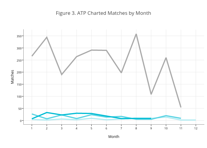
The lack of a census of matches might be okay for some purposes if the sample we have is representative of tour matches. We would be in trouble, for example, if we wanted to research the frequency of tiebreaks and there happened to be an over-representation of matches played by John Isner in the charted sample. The fact that the peakiness of the patterns of charted matches (Figure 3) is not similar to the peakiness of the actual season raises some concern about representativeness.
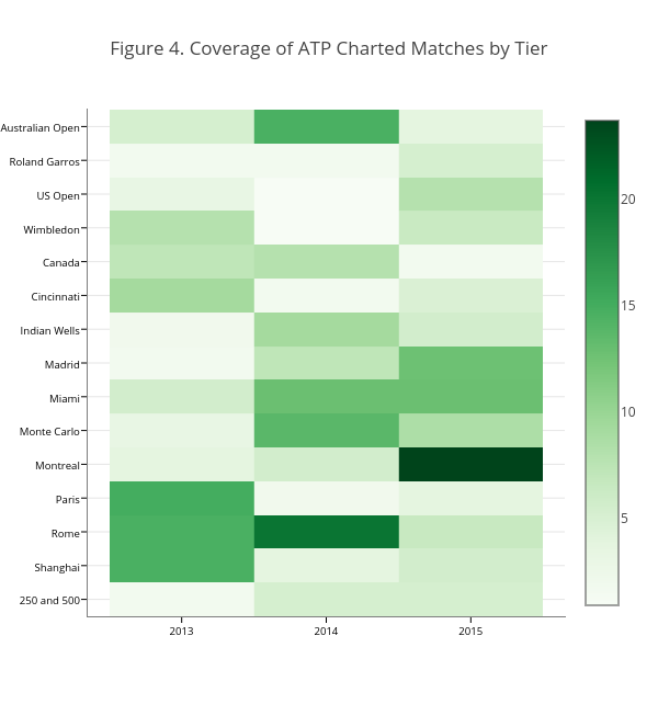
The heatmap in Figure 4 shows the percentage of actual matches covered by tier. The suggested pattern is mostly erratic with respect to tournament level. The percentage of matches at Grand Slams has generally been less than the Masters 1000, with the exception of the Australian Open in 2014. However, this could be owing to the fact that more matches are played at the Slams than Masters and you simply need more manpower to keep up. Among the Masters, there is some suggestion that clay court tournaments are currently over-represented compared to the actual number they make up in the 1000 series.
What does this all mean for tennis researchers? The main takeaway is that the Match Charting Project is still growing and the current coverage is limited. There is no obvious pattern of selection bias with respect to tier, which is a reassurance, but only begins to scratch the surface of potential causes of match selection. In the meantime, researchers will have to be careful to evaluate whether their particular use of these data depends on having a representative sample of matches.
The metadata on the project still needs a crowd to get behind it, where 1000s of contributors would be involved. The success of Wikipedia suggests that the crowd of contributors is out there but utilizing the crowd needs to have a low-cost of entry. If there were some technical strategies that could make charting more accessible and less burdensome–like having persons chart just a sample of points using a user-friendly interface–it could be a real boon to the effort. Other human-computing efforts have shown that a mass of non-professionals can solve complex problems. So why not for tennis too?
Readers interested in contributing to the Match Charting Project can get started here.
Addendum: I did want to note that one tool for helping to get a crowd-sourcing solution to charting is an Android app made by Ink Lily.
If you liked this story, share it with your followers or follow this site @StatsOnTheT on Twitter.