Charting Serve Locations
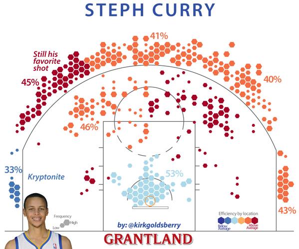
18 Aug 2016One of the many things I miss after the dissolution of Bill Simmons’ sports blog Grantland is Kirk Goldsberry’s NBA shot charts. The classic version of the Goldsberry shot chart is a plot of hexagonal bins showing the locations and frequency of where a player takes shots overlaid onto a representation of the basketball court. Combined with heavy annotation and a lot of style, the charts are both effective at communicating shot tendencies and a pure pleasure to read (an example for Steph Curry is shown to the right).
Fortunately, Goldsberry continues to post new charts on Instagram.
The question I have been asking myself for a long time, is why tennis doesn’t have it’s own “shot chart”?
Tennis, like the NBA, is a sport largely defined by player and ball movement around the court. So the value of having appealing and informative charts for summarizing spatial information about ball and player position is a no-brainer. It’s just a matter of bringing the right data and tools together.
Serve Location Charts with ggplot2
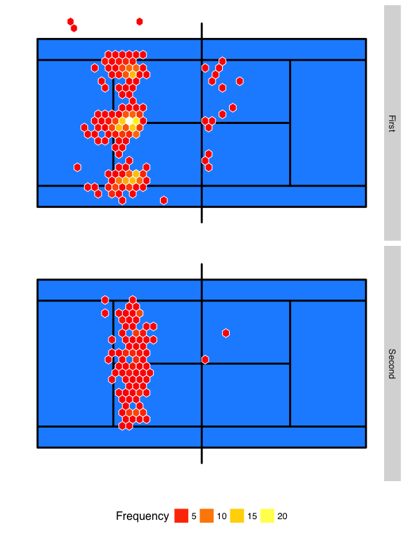
In this post, I want to show how a basic version of a “shot chart” can be made with ggplot2 to show serve location patterns. Below is a snippet of the R Code for drawing a representation of a court and plotting the frequency of shot locations with geom_hex.
court_rect <- data.frame(
  x = c(-11.89, -11.89, 11.89, 11.89),
  y = c(-6.5, 6.5, 6.5, -6.5))

court_trace <- data.frame(x = c(-11.89, -11.89, 0, 0, 0, 0, 0, 0,
                               11.89, 11.89, -11.89, -11.89, 11.89,
                               11.89, -11.89, -6.4, -6.4, 6.4, 6.4,
                               6.4, -6.4),
                         y = c(5.49, -5.49, -5.49, -6.5, -6.5, 6.5,
                               6.5, -5.49, -5.49, 5.49, 5.49, 4.115,
                               4.115, -4.115, -4.115, -4.115, 4.115,
                               4.115, -4.115, 0, 0))


labeller_function <- function(variable, value){

    labels <- list(
        "1" = "First",
        "2" = "Second"
    )

labels[value]
}

ggplot(data = federer, aes(x = center_x, y = center_y)) +
  facet_grid(serve ~ ., labeller = labeller_function) +
  geom_rect(aes(xmin = -11.89, xmax = 11.89, ymin = -5.49, ymax = 5.49),
    fill = '#1e90ff') +
  geom_path(data = court_trace, aes(x = x, y = y),
    color = "black", size = 1) +
  geom_hex(colour = "white", binwidth = c(.5, .5)) +
  scale_fill_gradientn(name = "Frequency", colours = heat.colors(30),
    guide = "legend", breaks = seq(0, 30, by = 5)) +
  scale_y_continuous("", lim = c(-7, 7), breaks = NULL) +
  scale_x_continuous("", lim = c(-12, 12), breaks = NULL) +
  theme_hc()
The serves that are shown are Roger Federer’s first and second serve locations over all of his matches at the 2016 Australian Open. Both good serves and faults are included. All serves have been oriented so that the server serves from the right side and good serves land in the left side service box.
The resulting chart creates hexagons of fixed size of 0.5 meters along the length and width of the court. Within each hexagonal region, the plot counts the number of shots landing in the region and applies a color gradient to these colors.
We see from his that the high-frequency areas for the first serve are deep down the T and wide. On the second serve, the depth is notably less and there is much greater uniformity in the distribution of locations across the width of the service box. As expected, faults on the second serve are also much less common.
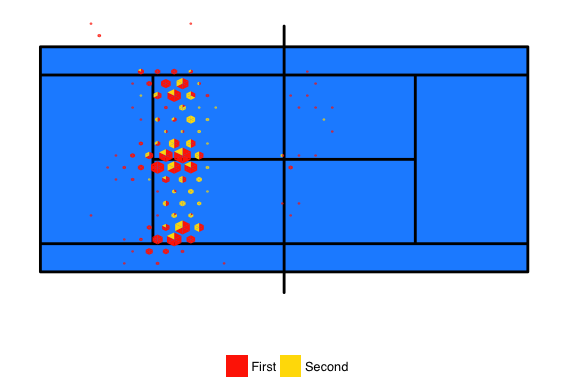
Serve Location Charts with hextri
The hextri package of Thomas Lumley is another way to perform hexagonal binning. Some advantages with hextri is that it scales the size of the hexagon with the frequency of points in the region. This frees up color to be used for an additional variable other than location frequency.
Another advantage with this package, is that it can calculate multiple classes within the same hexagon and display the relative frequency of each class as triangles. The resulting bins can be plotted directly with hextri or the polygons can be extracted and supplied to ggplot.
Using the same set of Federer serves, the example below shows how hextri and ggplot can be combined to make a direct comparison of first and second serve locations.
all_hex <- hextri(federer$center_x, federer$center_y, class = federer$serve,
                  col = heat.colors(30)[c(5, 20)], nbins = 15, style = "size")

col.group <- unique(all_hex$col)

all_hex.df <- data.frame(
       x = all_hex$x[!is.na(all_hex$x)],
       y = all_hex$y[!is.na(all_hex$x)],
       tri = rep(1:length(all_hex$col), rep(3, length(all_hex$col))),
       col = rep(all_hex$col, rep(3, length(all_hex$col))))

ggplot() +
  geom_rect(aes(xmin = -11.89, xmax = 11.89, ymin = -5.49, ymax = 5.49), fill = '#1e90ff') +
  geom_path(data = court_trace, aes(x = x, y = y), color = "black",
    size = 1) +
  geom_polygon(data=all_hex.df, aes(x=x, y=y, group=tri, fill=col),
    alpha = 1) +
  scale_fill_identity(name = "", guide = "legend",
    labels = c("First", "Second")) + coord_equal()  +
  scale_y_continuous("", lim = c(-7, 7), breaks = NULL) +
  scale_x_continuous("", lim = c(-12, 12), breaks = NULL) +
  theme_hc() +
  theme(legend.position = "bottom")
The resulting chart below does a better job of showing that shallow serves to the center of the court would be highly unlikely on a first serve from Federer.
Some Thoughts
The code above create the most basic version of a shot chart for tennis serves. There are still a lot of things that could be done to improve on these versions. Work that has been done in R with NBA data suggests some possible improvements. One that I am particularly interested in is showing player shot location patterns compared to average.
Earlier, I mentioned that the development of visualizations like these needed data + tools. Although Hawkeye has made more partnerships with individuals and organizations, like Tennis Australia where I work, to use tracking data for research purposes, those data remain largely closed. By comparison, tracking data for the MLB and NBA have been much more accessible. And I don’t think it is a coincidence that these sports have also made some of the greatest advances in sports statistics and popular analytics. Although not the main topic of this post, I did want to acknowledge that tennis’ analytics problem is as much about data openness as methods development.
If you liked this story, share it with your followers or follow this site @StatsOnTheT on Twitter.