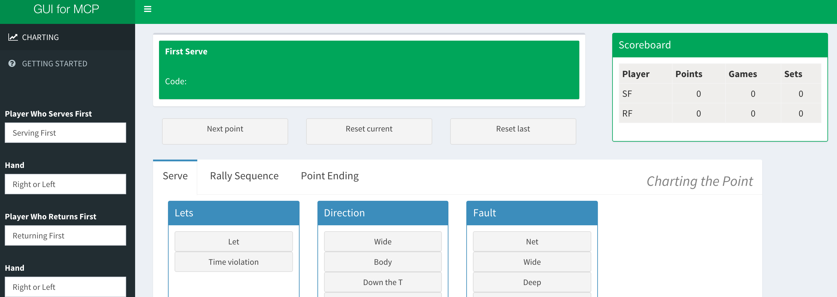
Introducing a GUI for the Match Charting Project
07 Feb 2016We are just a little more than a month into the 2016 tennis season. With 10 months of matches, 3 Grand Slams, and the Rio Olympics ahead of us; there is plenty to look forward to.
Still, every year the data the sport gathers and makes available to the public is way too basic. You know those end-of-match summaries with the simple counts of first serve points, second serve points, etc.? That is usually the best data we can hope for to capture what happened in a match.
The Match Charting Project (MCP), spearheaded by Jeff Sackmann of TennisAbstract and Heavy Topspin, is trying to change all of that. The MCP is an effort to gather shot-by-shot descriptions of the events in tennis matches using volunteer coders. That’s right. Any of us can get involved.
The MCP has been going strong for several years. But with the number of matches that occur each season (equivalent to 15 matches per day for the WTA and ATP, not even including Challenger of qualifying matches!), more contributors are needed.
Now comes a confession…I tried charting a number of times when I first heard about the project. But I just couldn’t do it.
I felt with enough practice I would eventually, like with a new language, have a breakthrough. At the same time, I figured I could start charting much more quickly if I had a tool that could do the coding for me— an interpreter, in effect. So I built something that worked for (impatient) me and was able to chart 2 matches fairly quickly. You can read more about how the GUI works under the `Getting Started’ tab.
I still have a long way to go before reaching supercontributor status, but this experience made me think that others might find this tool useful for charting too. So I have made a public version you can find here. This is a simple point-and-click interface that is intended for people who haven’t charted a match yet but would like to without having to learn the code. In this way, the goal is to complement the tool Jeff Sackmann has already created, which can be used to chart much more quickly once one knows `the code’ but has a steeper learning curve. My hope is that the GUI can be an entryway to charting with the code; or a tool to help those (like myself), who might have otherwise needed a lot of time to contribute, to start contributing right away.
I have also made the source code for the app available on Github. There are a lot of improvements that could be added. Since I have reached the limit of my Web development skills, I am hoping that some bright developers out there will work some wonders with this concept.
I’ll continue to maintain the current version, and your feedback is welcome.
If you liked this story, share it with your followers or follow this site @StatsOnTheT on Twitter.

